Sympathy cards are one of those kinds of cards that are very difficult to make. For me, it is even more difficult than musculine cards. This year, for whatever reasons, I have made a couple of them and they were used already.
Some of my friends "borrow" cards from my stash. The demand was the greatest in May for Mother's Day (For the dads out there: we love you too!), and unfortunately many had to borrow my sympahty cards, leaving them extremely low in the inventory. So I was prompted to make one today.
My inspiration came from two sources: CAS-ual Fridays that asks us to put our heart into it:
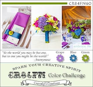
and a color combo provided by CR84FN Color Challenge:
I've chosen Blush, Desert Sand and Colonial White to replace Light Pink, Tan and Cream respectively.
My card has very clean lines but nevertheless embellished by a pewter element:
I wanted to make a card that is not in the usual size of 4.25" x 5.5" so I made this one of 8" x 3.5". I have only used one stamp image, except that I "broke" the image into two parts where I stamped "are with you" first, then lined up the pewter bracket and found where I should stamp "hearts". There was no more room for the word "Our" so I wrote it on the little heart sponged in Blush. Not bad, huh?
Thanks for stopping by!
Showing posts with label CR84FN Challenge. Show all posts
Tuesday, October 16, 2012
Thursday, August 16, 2012
A Sympathy Card
I came a challenge that really caught my eyes - A card that is white on white - presented by Crazy 4 Challenges. Em, is it possible at all?
The Challenge allows us to use a tiny bit of color on the stamped image. I've chosen black and I thought, what about a sympathy card?
Since color is lacking, I wanted to make sure this card is not a boring one that says "with sympathy." I've consulted Make it from Your Heart, the how-to program, and used one of the patterns there. In fact, even though I did not do it on purpose, for some reason my finished card has many elements similar to the sample it shows.
My card has a lot of white indeed:
I'm also entering the following challenges:
1. 365 Cards - use at least 3 flowers
2. Just Us Girls - Technique challenge with the use of ribbon
3. UnstampaBelles Challenges - Paper flowers
Wednesday, August 8, 2012
Random stamping
It's time to show you how versatile clear stamps can be. I've chosen the color scheme provided by CR84FN to demonstrate random stamping:
I think the closest colors in the Close to My Heart palette are Smokey Plum, Twilight and Olive.
To make this card, I've randomly stamped the images on a Colonial White cardstock. Personally I like to leave some empty space, but had I chosen to fill in the space, it would look more like patterned paper.
Do I have a trick to make it look natural? Yes!
You want to choose three images of different sizes - big, medium and small, preferably of different shapes as well. Here the Olive florish is a contrasting shape comparing to the medallions. Then you want to pick one color for each shape. Here, I stick to the color scheme provided by the challenge. You want to stamp one image at a time, and that image wants to create a triangle. If you look closely you'll see the purple medallions form a triangle while the green florishes form another. The most important thing is, of course, CLEAR stamps! I love how easy it is to see exactly where I stamp. You see the little grey circle in the purple medallions? I can't imagine using a stamp positioning tool every time I stamp it. I really can't, I may want to give up this fun technique if I have to use the tool.
This technique is fun and easy. You'll create your own patterned paper that is truly unique. Try it out!
Subscribe to:
Posts (Atom)