My blog has been oh so quiet. Well, it all started when my Cricut Explore broke down several weeks ago. I somehow fixed it but it showed its attitude from time to time. When it worked it's fine but if it didn't it is extremely frustrating. Perhaps it's sign that I should upgrade my machine!
But the major reason is that I'm making an unplanned move. It wasn't well-planned at least. I had very little time to move. Serious I just threw everything in my suitcases and boxes and thought I would organize in my new place.
Now most of my craft supplies have been shipped to my new place. It is almost impossible to craft, but you know I am just itching to play! So I played along Shimelle's challenge - go big with red:
This is the second to last thing I made before my actual move. Will share the card I made later this week.
Thanks for stopping by!
Showing posts with label Layouts. Show all posts
Sunday, November 13, 2016
Sunday, October 30, 2016
Oh deer!
It has been a while since I shared any layouts. It was partly because I was waiting for prompts and challenges on Shimelle's blog. Her blog was silent for a while because her phone was crashed. But she got to immerse herself in the vacation without looking at the phone. Nice!
She has returned and posted several challenges. I'm excited to play along!
One of the challenges is to scrapbook the outdoors. This is a challenge I *need*! I still have a ton of pictures from my trip to Banff to document.
I decided to make a simple page to "warm up":
This page documents the story where we saw three deer going from the big to the small island inside the lake. My family and I quietly watched them as they walk. All hikers were amazed and speechless!
I was happy to play with a variety of products, including Crate paper patterned paper, Amy Tangerine stickers from Oh Happy Life, Kelly Purkey's project life cards from July Stay Cool Kit.
Now that I have the supplies out, I'm going to play more with them!
Thanks for stopping by!
She has returned and posted several challenges. I'm excited to play along!
One of the challenges is to scrapbook the outdoors. This is a challenge I *need*! I still have a ton of pictures from my trip to Banff to document.
I decided to make a simple page to "warm up":
This page documents the story where we saw three deer going from the big to the small island inside the lake. My family and I quietly watched them as they walk. All hikers were amazed and speechless!
I was happy to play with a variety of products, including Crate paper patterned paper, Amy Tangerine stickers from Oh Happy Life, Kelly Purkey's project life cards from July Stay Cool Kit.
Now that I have the supplies out, I'm going to play more with them!
Thanks for stopping by!
Sunday, October 2, 2016
Sunshine Village
I have to make this post quick and simple because I'm trying to catch the deadline to link up to Shimelle's challenge.
She asked us to use her travel page as inspiration to create our own page. I created a travel page based on her sketch, but mine is much simpler:
I do have another horizontal 4x6 photo but the lighting of these two photos do not match so instead of using two photos, I used a project life card from Kelly Purkey. The middle and right tags are project life cards. I cut them into a tag shape so my page can mimic Shimelle's.
To add some texture, I added twine and ribbon to the tags, cloud transparency and I've drawn some clouds using watercolor.
It's fun creating this page and I'll continue to tell the stories happened at Sunshine Village through other pages.
I'm linking the page to
Shimelle's - her page as inspiration
The Studio Challenge - watercolor
Thanks for stopping by!
She asked us to use her travel page as inspiration to create our own page. I created a travel page based on her sketch, but mine is much simpler:
I do have another horizontal 4x6 photo but the lighting of these two photos do not match so instead of using two photos, I used a project life card from Kelly Purkey. The middle and right tags are project life cards. I cut them into a tag shape so my page can mimic Shimelle's.
To add some texture, I added twine and ribbon to the tags, cloud transparency and I've drawn some clouds using watercolor.
It's fun creating this page and I'll continue to tell the stories happened at Sunshine Village through other pages.
I'm linking the page to
Shimelle's - her page as inspiration
The Studio Challenge - watercolor
Thanks for stopping by!
Monday, September 19, 2016
Lake Moraine
Today, I'm sharing a layout showing pictures taken at Lake Moraine.
I've used the sketch from Let's Get Sketchy:
My photos are landscape so I turned the sketch 90 degrees clockwise to create my layout:
I realized that I need some blues and greens to scrapbook this trip to Banff! I don't have that much but I have a leaf patterned paper for background which gives me the opportunity to take the Challenge at Shimelle's blog - to use leaves. :)
Thanks for stopping by and have a great week!
Wednesday, September 14, 2016
Lake Louise
During last month's family reunion, we went to Banff and other places. We loved the scenic beauty! The weather was not always the best but we kept on taking pictures regardless. The views were just breathtaking!
I'm sharing one picture taken by my phone while we were at Lake Louise. It was cloudy when we arrived. Because of that, we thought we would take pictures after our hike. Guess what? After the hike up to tea house, it poured.
I'm using the sketch at Let's Get Sketchy:
The beauty of the lake is best documented using a simple layout. I'd like the picture to be the focus because I just wanted to capture its beauty. It doesn't need a busy layout or many embellishments. The picture itself should pop. A picture is worth a thousand words. Even my journaling is kept to a minimal.
Thanks for stopping by!
I'm sharing one picture taken by my phone while we were at Lake Louise. It was cloudy when we arrived. Because of that, we thought we would take pictures after our hike. Guess what? After the hike up to tea house, it poured.
I'm using the sketch at Let's Get Sketchy:
The beauty of the lake is best documented using a simple layout. I'd like the picture to be the focus because I just wanted to capture its beauty. It doesn't need a busy layout or many embellishments. The picture itself should pop. A picture is worth a thousand words. Even my journaling is kept to a minimal.
Thanks for stopping by!
Monday, September 12, 2016
Killing time (and products)
Due to a lot of reasons, I had a lot of time waiting for my flight. I took out my Ernie figurine and started taking pictures of him at the gate. For your reference, this figurine is my travel buddy. He has gone on numerous trips with me pre-iphone era. Back then, I don't think there was something called selfie. So when I wanted to take a picture of a landmark, I either take a picture like I would a postcard, or make him the face in my picture.
Today, I take selfies when I travel thanks to my smart phones. But I still take him with me on trips and take pictures of him. I even make a layout of him this time.
Shimelle is challenging us to use floral motifs on our layout. How am I going to use flowers with Ernie?
I used the floral patterned paper as the background paper, then put his picture on a stripe paper to create some contrasts. Each cluster of the embellishments has a resin flower. It doesn't seem to be a girly layout, does it?
Anyhow, I just wanted to document the things I did while waiting for my flight. Further, I'm glad that I finally used all the products from the kit I bought at a show TWO+ years ago (did you see the plus sign?). I normally do not use so many embellishments on a page, but here, there are four tags on the title, many resin flowers, buttons, and stickers. That's ok, I told myself, as now I have more room for new goodies. :)
Thanks for stopping by and have a great week!
Monday, September 5, 2016
LOTSA Time
Hello everyone! I hope those who are in the US are having a wonderful long weekend.
I'm certainly enjoying mine. Certain items on my to-do lists are done (finally!), and I had spent some great time with friends and also some for crafting! So happy!
I have been meaning to participate in scrapbook/layout challenge and I'm finally making it happen!
On Shimelle's blog, she is challenging us to use lots of layers.
I've made a simple one-page layout using a lot of layers from scraps:
Layout challenges are certainly fun. I hope to do more in the future!
Thanks for stopping by!
I'm certainly enjoying mine. Certain items on my to-do lists are done (finally!), and I had spent some great time with friends and also some for crafting! So happy!
I have been meaning to participate in scrapbook/layout challenge and I'm finally making it happen!
On Shimelle's blog, she is challenging us to use lots of layers.
I've made a simple one-page layout using a lot of layers from scraps:
Layout challenges are certainly fun. I hope to do more in the future!
Thanks for stopping by!
Tuesday, July 19, 2016
Throwback
Heart 2 Heart challenges is hosting a challenge themed Throwback, where we can upload our projects made with my beloved Close to My Heart products, such as paper, ink, stamp, etc. I am so going to participate! Woohoo!
I am proud to announce that I am slowly recovering from the disease where I called "saving the product for the perfect occasion". I used to worry that if I cut that pretty paper incorrectly, I'll be wasting my project. I used to think that some paper packs are just too pretty to cut. I used to save many cute items for a project I don't really have a time frame for......
One of my 2016 resolutions is to use products. I'm happy to say that I'm on the right track. By that I mean I'm no longer afraid to cut the pretty paper or stick that embellishment on a card. I still hold myself back a little bit, such as saving a few of those sequins or enamel dots, but I'm making progress because I no longer hold onto the entire pack of embellishments like I did before!
Years ago Close to My Heart released a paper pack called Topstitch. That was one of those I thought I would never let go. It had taken me years to finally use it. And I'm making a scrapbook page, so it will be cherished:
I love blue, all shades of blue. This paper pack had used a baby blue that's irresistible. The baby blue matches perfectly with Chocolate and a baby pink. Oh how I love those pinwheels, they are cute and tiny. The voice in my head was telling me to keep it and save it.
Another resolution I had is to purge frequently. Earlier this year I did a massive cleanup (and I plan to do another after my family reunion!) and while organizing, I came across this pretty Topstitch paper. I thought to myself: I'd better use it soon, otherwise it will have to go to another home. So I made a conscious effort to make something with it. This challenge presented a perfect opportunity!
So glad I've made a page with it. Not only because I've made use of it, but also because I have turned it to something I'll cherish together with my memories.
Thanks for stopping by!
I am proud to announce that I am slowly recovering from the disease where I called "saving the product for the perfect occasion". I used to worry that if I cut that pretty paper incorrectly, I'll be wasting my project. I used to think that some paper packs are just too pretty to cut. I used to save many cute items for a project I don't really have a time frame for......
One of my 2016 resolutions is to use products. I'm happy to say that I'm on the right track. By that I mean I'm no longer afraid to cut the pretty paper or stick that embellishment on a card. I still hold myself back a little bit, such as saving a few of those sequins or enamel dots, but I'm making progress because I no longer hold onto the entire pack of embellishments like I did before!
Years ago Close to My Heart released a paper pack called Topstitch. That was one of those I thought I would never let go. It had taken me years to finally use it. And I'm making a scrapbook page, so it will be cherished:
I love blue, all shades of blue. This paper pack had used a baby blue that's irresistible. The baby blue matches perfectly with Chocolate and a baby pink. Oh how I love those pinwheels, they are cute and tiny. The voice in my head was telling me to keep it and save it.
Another resolution I had is to purge frequently. Earlier this year I did a massive cleanup (and I plan to do another after my family reunion!) and while organizing, I came across this pretty Topstitch paper. I thought to myself: I'd better use it soon, otherwise it will have to go to another home. So I made a conscious effort to make something with it. This challenge presented a perfect opportunity!
So glad I've made a page with it. Not only because I've made use of it, but also because I have turned it to something I'll cherish together with my memories.
Thanks for stopping by!
Monday, July 11, 2016
Instax fun
Hello Monday!
It has been a long time since I last posted work of my own. In reality, I haven't been able to do much crafting (sobbing face inserted).
It's summertime and co-workers are literally taking turns to take time off. It's usual except this year the supervisors/managers are taking extended vacation. By that I mean it's a whole month! I am looking forward to my own vacation and family reunion next month. Another 3 weeks to go.
So I have been working crazily busy during the week and on weekends, I am doing research and planning for the family trip. We had many exciting ideas when we first planned it but we decided to make it simple. We have a big group of 8, with older folks like my parents and little ones my niece and my nephew, who just started walking. My brother and I have to plan well enough to ensure things go smoothly. If it was just me and my backpack, things would be much easier. Family trips, however, require quite a bit of planning. I am research the time it takes from point A to point B (and so nice Google can estimate that for different times of the day, and different days of a week), and closest restaurants next to certain sight seeing spots. I am about to make reservations for lunch/dinner too.
It's fun. No complaints (even though no time to craft). I'm grateful that everyone in my family is easy going. Even if we have to wait in line, we will still be happy. My dad, however, can be high maintenance sometimes. Only sometimes. One of the things he complains about us is that we do not travel light. I don't know how he does it. Be it a day trip or a month-long trip, he packs so everything in a carry-on. Years ago he complained that my brother and I each had an SLR camera while he had a super compact digital one.
This time I'm not taking an SLR with me. I'm going to bring, however, an Instax camera. I'm afraid I'll make my dad's blood boil. Oops. Not that bad but you get the idea. My niece and nephews have been "posing" for us to take pictures, but except for the mini-albums I made for them, I doubt if the pictures have ever been developed. So I wanted to take this trip to show them pictures in their physical form. I have even bought an album for them to put in the instax pictures.
I have never used an Instax camera before (isn't it embarrassing to admit this?) so I tested it out. Immediately after that I've made a layout with it using the Magical paper:
It's a random picture so it was quite a bit difficult for me. I used a sketch from Kelly Purkey's class at Craftsy. Hers is a 8.5 x 11 layout, so I had to modify it a bit. I used the Artbooking cartridge to create the tone-on-tone background, then I cut out the instax camera from one of the cut-apart sheet in Magical paper pack as an accent, I used the stamps from the current Stamp of the Month From the Notebook to make the tag, the lens of the camera "super". I also added the stamp "real life" as part of the embellishment below the picture. I love love love this stamp set. Absolutely versatile!
So that's my first instax photo and the layout documenting the reason I got the camera. I'm entering this layout to Heart 2 Heart Challenges - Magical.
Thanks for stopping by and have a great week!
It has been a long time since I last posted work of my own. In reality, I haven't been able to do much crafting (sobbing face inserted).
It's summertime and co-workers are literally taking turns to take time off. It's usual except this year the supervisors/managers are taking extended vacation. By that I mean it's a whole month! I am looking forward to my own vacation and family reunion next month. Another 3 weeks to go.
So I have been working crazily busy during the week and on weekends, I am doing research and planning for the family trip. We had many exciting ideas when we first planned it but we decided to make it simple. We have a big group of 8, with older folks like my parents and little ones my niece and my nephew, who just started walking. My brother and I have to plan well enough to ensure things go smoothly. If it was just me and my backpack, things would be much easier. Family trips, however, require quite a bit of planning. I am research the time it takes from point A to point B (and so nice Google can estimate that for different times of the day, and different days of a week), and closest restaurants next to certain sight seeing spots. I am about to make reservations for lunch/dinner too.
It's fun. No complaints (even though no time to craft). I'm grateful that everyone in my family is easy going. Even if we have to wait in line, we will still be happy. My dad, however, can be high maintenance sometimes. Only sometimes. One of the things he complains about us is that we do not travel light. I don't know how he does it. Be it a day trip or a month-long trip, he packs so everything in a carry-on. Years ago he complained that my brother and I each had an SLR camera while he had a super compact digital one.
This time I'm not taking an SLR with me. I'm going to bring, however, an Instax camera. I'm afraid I'll make my dad's blood boil. Oops. Not that bad but you get the idea. My niece and nephews have been "posing" for us to take pictures, but except for the mini-albums I made for them, I doubt if the pictures have ever been developed. So I wanted to take this trip to show them pictures in their physical form. I have even bought an album for them to put in the instax pictures.
I have never used an Instax camera before (isn't it embarrassing to admit this?) so I tested it out. Immediately after that I've made a layout with it using the Magical paper:
It's a random picture so it was quite a bit difficult for me. I used a sketch from Kelly Purkey's class at Craftsy. Hers is a 8.5 x 11 layout, so I had to modify it a bit. I used the Artbooking cartridge to create the tone-on-tone background, then I cut out the instax camera from one of the cut-apart sheet in Magical paper pack as an accent, I used the stamps from the current Stamp of the Month From the Notebook to make the tag, the lens of the camera "super". I also added the stamp "real life" as part of the embellishment below the picture. I love love love this stamp set. Absolutely versatile!
So that's my first instax photo and the layout documenting the reason I got the camera. I'm entering this layout to Heart 2 Heart Challenges - Magical.
Thanks for stopping by and have a great week!
Monday, June 6, 2016
Magical
My dry eye symptoms persist so I have to refrain from using the computer. Argh!
But because I have to do warm compress constantly over the weekend, I stayed in most of the time. That means quite a bit of crafting done. I was still working on the birthday cards my mom "ordered". Then I also did some organization. Funny I was giving many items "one last chance" before I send them to donation. But after I have played with it, I had a change of heart. Do I really want to toss it? I asked myself. Then I put that item back in my usual organization rather than the box which will go to donation. I learned this weekend that I need to stay strong. Once I have decided to part with it, I should never look back. Why did I go back to that donation box??
As I was making cards for my mom, I had a little detour and made a quick and easy layout, using the new Magical paper from Close to My Heart.
I have been asked many times how I adopt or adapt a paper pack that seems to have a strong theme for my own use. I don't think I have a knack for it but I can definitely share what i do.
I almost always start a layout with my pictures. This way, I can ensure that I'm focusing on my pictures. Then I choose my papers. That's right, I choose the papers that fit my pictures. At this point you may be wondering why I chose the Disney-themed paper for my pictures.
For the pictures above, for instance, I notice that my nephew J was in a baby blue bib and I was wearing dark colors. The background of the picture is my brother's house and it was bright and white because it was in the morning. It also showed a bit of his fancy kitchen.
In the selection process, I knew I wanted to have some blue in the background. Blue was actually my "must have" because I wanted baby J to be the focus. I knew that Magical has some blue so I took a look at it. There is a sheet of blue patterned paper, which is actually the back of the black paper I used above, showcasing a repeating pattern of tickets. I wanted to use that as a mat for my photos, but the patterns are quite too big to be shown as a border so that idea was aborted.
There is a white patterned paper with very small gray triangles repeating throughout the sheet. That is a perfect paper for photo mats - it has subtle patterns that bring interest but not too distracting; AND the patterns are small enough to be recognized. I brought that paper close to my photos and bingo!
Now that I've decided on the mats, I would love to use colors and patterns that show a contrast. The black patterned paper with camera motives was perfect. It's black background against the white-matted photos. That's the biggest contrast I can get in the world, right?
The next decision I made was to bring in blue to the page. At this point, I only have black and white! So I used a sheet of blue cardstock as the base of the page. I wanted to use the "Love this" 6*4 card as my title, so I naturally used two strips of red patterned paper to envelope the black background.
Throughout the whole process, I didn't do anything to "De-Disney" the paper. I focused on the pictures and find the right paper with the right pattern and colors to serve the purpose I wanted. And I must say, although the colors of Magical may suggest a lot of Disney, the patterns like ticket motif, cameras, triangles are very neutral. They are not Disney-bound. Some crafty friends turn away from Magical because they say they didn't have any Disney photos. But who says Magical is only good for a Disney trip?
So that's my paper selection process. I always focus on my pictures and try to use the papers that share common elements with my pictures. Did I mention that the sketch comes from Reflections, a great How-to book for scrapbooking? It helped a lot during the process! I knew from the beginning how many sheets I needed so I wouldn't have to search for more than necessary. :)
When we adopt the paper for our own use, we are making it more versatile and maximizing it. How nice!
Thanks for stopping by!
But because I have to do warm compress constantly over the weekend, I stayed in most of the time. That means quite a bit of crafting done. I was still working on the birthday cards my mom "ordered". Then I also did some organization. Funny I was giving many items "one last chance" before I send them to donation. But after I have played with it, I had a change of heart. Do I really want to toss it? I asked myself. Then I put that item back in my usual organization rather than the box which will go to donation. I learned this weekend that I need to stay strong. Once I have decided to part with it, I should never look back. Why did I go back to that donation box??
As I was making cards for my mom, I had a little detour and made a quick and easy layout, using the new Magical paper from Close to My Heart.
I have been asked many times how I adopt or adapt a paper pack that seems to have a strong theme for my own use. I don't think I have a knack for it but I can definitely share what i do.
I almost always start a layout with my pictures. This way, I can ensure that I'm focusing on my pictures. Then I choose my papers. That's right, I choose the papers that fit my pictures. At this point you may be wondering why I chose the Disney-themed paper for my pictures.
For the pictures above, for instance, I notice that my nephew J was in a baby blue bib and I was wearing dark colors. The background of the picture is my brother's house and it was bright and white because it was in the morning. It also showed a bit of his fancy kitchen.
In the selection process, I knew I wanted to have some blue in the background. Blue was actually my "must have" because I wanted baby J to be the focus. I knew that Magical has some blue so I took a look at it. There is a sheet of blue patterned paper, which is actually the back of the black paper I used above, showcasing a repeating pattern of tickets. I wanted to use that as a mat for my photos, but the patterns are quite too big to be shown as a border so that idea was aborted.
There is a white patterned paper with very small gray triangles repeating throughout the sheet. That is a perfect paper for photo mats - it has subtle patterns that bring interest but not too distracting; AND the patterns are small enough to be recognized. I brought that paper close to my photos and bingo!
Now that I've decided on the mats, I would love to use colors and patterns that show a contrast. The black patterned paper with camera motives was perfect. It's black background against the white-matted photos. That's the biggest contrast I can get in the world, right?
The next decision I made was to bring in blue to the page. At this point, I only have black and white! So I used a sheet of blue cardstock as the base of the page. I wanted to use the "Love this" 6*4 card as my title, so I naturally used two strips of red patterned paper to envelope the black background.
Throughout the whole process, I didn't do anything to "De-Disney" the paper. I focused on the pictures and find the right paper with the right pattern and colors to serve the purpose I wanted. And I must say, although the colors of Magical may suggest a lot of Disney, the patterns like ticket motif, cameras, triangles are very neutral. They are not Disney-bound. Some crafty friends turn away from Magical because they say they didn't have any Disney photos. But who says Magical is only good for a Disney trip?
So that's my paper selection process. I always focus on my pictures and try to use the papers that share common elements with my pictures. Did I mention that the sketch comes from Reflections, a great How-to book for scrapbooking? It helped a lot during the process! I knew from the beginning how many sheets I needed so I wouldn't have to search for more than necessary. :)
When we adopt the paper for our own use, we are making it more versatile and maximizing it. How nice!
Thanks for stopping by!
Wednesday, May 18, 2016
Happy Day
Today I'm sharing a layout using the Close to My Heart Happy Times paper packet. It's soooo fun! Love it!
I documented the time I spent with my little niece R at the park. We played sand and even though we weren't at the beach, we had great fun!
I continue to emphasize the importance of documenting the little moments/details of our daily life. Summer vacay, travel or parties are just part of our lives. What's more important than to enjoy all little moments when they constitute most of our lives? Years from now, I'm sure R will appreciate this page and perhaps she will show her friends how she loved playing with her aunt Joyce when she was little. And for now, let me show this page to my friends and tell them how I love playing with my niece R. LOL.
I'm entering this layout to the Challenge at Heart 2 Heart, we are celebrating National Scrapbooking Month!
Thanks for stopping by!
I documented the time I spent with my little niece R at the park. We played sand and even though we weren't at the beach, we had great fun!
I continue to emphasize the importance of documenting the little moments/details of our daily life. Summer vacay, travel or parties are just part of our lives. What's more important than to enjoy all little moments when they constitute most of our lives? Years from now, I'm sure R will appreciate this page and perhaps she will show her friends how she loved playing with her aunt Joyce when she was little. And for now, let me show this page to my friends and tell them how I love playing with my niece R. LOL.
I'm entering this layout to the Challenge at Heart 2 Heart, we are celebrating National Scrapbooking Month!
Thanks for stopping by!
Saturday, April 30, 2016
Today is the last day
I just submitted all my Studio J purchases! Woohoo! If you have not done so, please work on them now. Unfortunately there will be no extension so if they are not redeemed, they will be forfeited.
Today is also the last day to purchase products from the Seasonal Expressions 1. Starting tomorrow, when the Seasonal Expressions 2 goes live, most products from the current mini catalog will become unavailable.
April's promotion Baby, I'm worth it is ending in just a few hours. If you want to know more about the perks of signing up this month, please read the details here.
Life in Pictures, Stamp of the Month of April will be discontinued as well. Act fast if you like it!
Apart from various reminders, I also want to share with you a layout I made using the cute Regatta paper. It has a nautical theme but it is not limited to that:
Last year I took a class taught by Amy Tangerine and I had so much fun! I had to take pictures with her as well! The pictures were captured by my iPhone but the quality wasn't bad at all! :)
I'm entering the challenge at Heart 2 Heart challenges. It is challenging us to use Regatta paper. If you have got the paper but are thinking about using it for something other than a beach/nautical themed project, go to the challenge page and be inspired by the beautiful work made by H2H design team!
Thanks for stopping by!
Today is also the last day to purchase products from the Seasonal Expressions 1. Starting tomorrow, when the Seasonal Expressions 2 goes live, most products from the current mini catalog will become unavailable.
April's promotion Baby, I'm worth it is ending in just a few hours. If you want to know more about the perks of signing up this month, please read the details here.
Life in Pictures, Stamp of the Month of April will be discontinued as well. Act fast if you like it!
Apart from various reminders, I also want to share with you a layout I made using the cute Regatta paper. It has a nautical theme but it is not limited to that:
Last year I took a class taught by Amy Tangerine and I had so much fun! I had to take pictures with her as well! The pictures were captured by my iPhone but the quality wasn't bad at all! :)
I'm entering the challenge at Heart 2 Heart challenges. It is challenging us to use Regatta paper. If you have got the paper but are thinking about using it for something other than a beach/nautical themed project, go to the challenge page and be inspired by the beautiful work made by H2H design team!
Thanks for stopping by!
Monday, April 25, 2016
Dinner at Ikko
Last July, I had the opportunity to enjoy a nice Japanese dinner at a restaurant called Ikko. I took many pictures of the food, despite the dark interior of the restaurant.
I have finally developed the pictures to create a scrapbook page:
I had to make two layouts - one for the food and one for the gluttons. This one is dedicated to the food. Sorry about the glare. I wish I knew how to take better pictures without background lighting. Note to self: try taking pictures during daytime instead. LOL.
I'm entering the challenge at Heart 2 Heart. The theme is Photo Op. For me, I'd love to capture all those little moments in life - those with family and friends are the precious ones, even if we are not doing anything special. Years later, these photos/layouts will help us remember what happened. I've specifically added two camera motives onto this layout.
Those cameras come from Life in Pictures, this month's Stamp of the Month. There are only a few days left to get this cute stamp set. Camera images can be used for cards and layouts. I've made a card here. It was just one image but with different colors, the camera image makes me smile.
Thanks for stopping by and have a great week!
I have finally developed the pictures to create a scrapbook page:
I had to make two layouts - one for the food and one for the gluttons. This one is dedicated to the food. Sorry about the glare. I wish I knew how to take better pictures without background lighting. Note to self: try taking pictures during daytime instead. LOL.
I'm entering the challenge at Heart 2 Heart. The theme is Photo Op. For me, I'd love to capture all those little moments in life - those with family and friends are the precious ones, even if we are not doing anything special. Years later, these photos/layouts will help us remember what happened. I've specifically added two camera motives onto this layout.
Those cameras come from Life in Pictures, this month's Stamp of the Month. There are only a few days left to get this cute stamp set. Camera images can be used for cards and layouts. I've made a card here. It was just one image but with different colors, the camera image makes me smile.
Thanks for stopping by and have a great week!
Monday, March 28, 2016
So Lovely
Sale PSA: Close to My Heart's Stampaganza (Buy Two Get One Free) campaign is ending this Thursday, the end of this Month. Even though I am the one who said I do not want to buy just because of a sale, I just put in an order with stamps and stamps only. This is a rare opportunity so take advantage of it.
Close to My Heart used to continue the production of all Cricut compatible stamps indefinitely. But it is changing its policy. Stamp sets will only be available during the life of the idea book where the stamps appear, even if it is a Cricut cartridge compatible stamp set. Further, all stamp sets in the current Seasonal Expressions will retire by end of April 2016. Some items, such as the thin cuts for this popular stamp set Springtime Wishes, were already sold out. So if you have been holding off, don't wait any longer as the hot items could be gone anytime soon.
A special stamp set Hello Paradise is only available until the end of this month. It is a cute stamp set with solid images that can be used for a variety of occasions. Close to My Heart has designed a few layouts with the use of this set. If you want to have a copy of it please contact me.
Today I'm sharing a layout. In particular, I'm taking this as an opportunity to answer a question I have received: how do you use certain themed paper for a completely differently themed layout? My simple answer is just go for it, have fun and adapt it to your need.
Some people think and feel that the Charlotte paper is wedding/romance themed. I do not disagree that some elements do remind us of love, wedding, bliss, etc. but look beyond those elements. What about the color scheme? What about the patterns? I have made numerous pages using this paper pack but none of them is wedding/love themed. For the one I'm sharing today, I used it on a layout for pictures I took at the awards banquet in last year's Convention:
See the 4x6 black cut- apart card on the right? It says "Home is wherever I'm with you." But I've covered up the text with another cut-apart card that only has arrows on it. They make quite a good match because the 4x6 black card also has some arrows. Another cut-apart card is full of lovely flowers, which can be used for all occasions anyway. I then grounded these elements with the label strip which has stripes only. Had I not told you about it, who would know that it was designed for weddings? These patterns are so versatile, and it will be a waste if we limit it to the use for weddings!
Next time if you turn down a paper collection because you do not like its theme, look beyond that and see if there are other elements that you like - motif, colors, patterns.
I'm entering my layout to the challenge at The Paper Girls - Paper Girls. What's better to capture an exciting moment where the crafty girls were taking pictures at the beginning of the banquet?
Thanks for stopping by!
Close to My Heart used to continue the production of all Cricut compatible stamps indefinitely. But it is changing its policy. Stamp sets will only be available during the life of the idea book where the stamps appear, even if it is a Cricut cartridge compatible stamp set. Further, all stamp sets in the current Seasonal Expressions will retire by end of April 2016. Some items, such as the thin cuts for this popular stamp set Springtime Wishes, were already sold out. So if you have been holding off, don't wait any longer as the hot items could be gone anytime soon.
A special stamp set Hello Paradise is only available until the end of this month. It is a cute stamp set with solid images that can be used for a variety of occasions. Close to My Heart has designed a few layouts with the use of this set. If you want to have a copy of it please contact me.
Today I'm sharing a layout. In particular, I'm taking this as an opportunity to answer a question I have received: how do you use certain themed paper for a completely differently themed layout? My simple answer is just go for it, have fun and adapt it to your need.
Some people think and feel that the Charlotte paper is wedding/romance themed. I do not disagree that some elements do remind us of love, wedding, bliss, etc. but look beyond those elements. What about the color scheme? What about the patterns? I have made numerous pages using this paper pack but none of them is wedding/love themed. For the one I'm sharing today, I used it on a layout for pictures I took at the awards banquet in last year's Convention:
See the 4x6 black cut- apart card on the right? It says "Home is wherever I'm with you." But I've covered up the text with another cut-apart card that only has arrows on it. They make quite a good match because the 4x6 black card also has some arrows. Another cut-apart card is full of lovely flowers, which can be used for all occasions anyway. I then grounded these elements with the label strip which has stripes only. Had I not told you about it, who would know that it was designed for weddings? These patterns are so versatile, and it will be a waste if we limit it to the use for weddings!
Next time if you turn down a paper collection because you do not like its theme, look beyond that and see if there are other elements that you like - motif, colors, patterns.
I'm entering my layout to the challenge at The Paper Girls - Paper Girls. What's better to capture an exciting moment where the crafty girls were taking pictures at the beginning of the banquet?
Thanks for stopping by!
Monday, January 18, 2016
Lucky Me
Anyone enjoying a long weekend because today is Martin Luther King's Day?
I have to go to work today and I envy those of you who have a 3-day weekend!
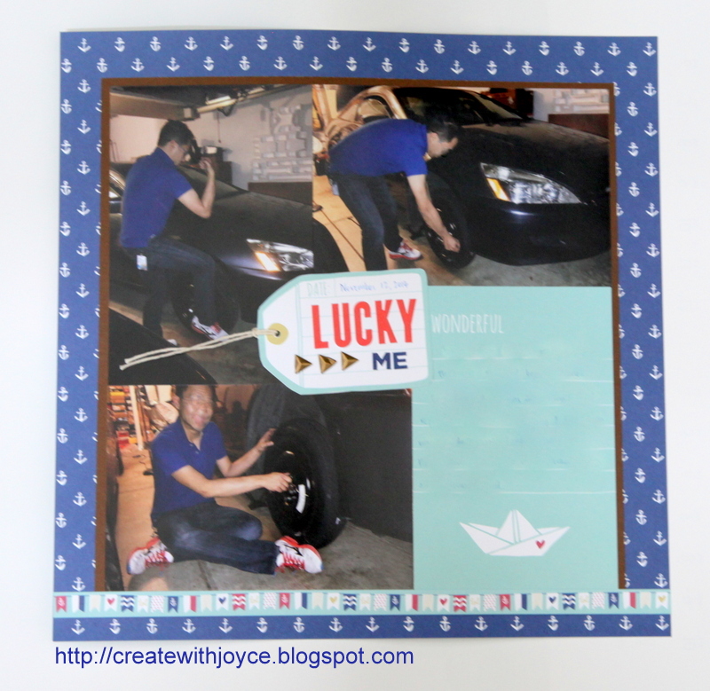
I mentioned before that the Regatta Collection from Close to My Heart has a nautical theme but the layouts I made didn't have anything to do with the sea, beach, or anything in that regard.
One of the layouts I made with Regatta Workshops Your Way captures the story that I was so lucky to have made it to my friend's place even though I wasn't aware of a flat tire! I was even more lucky to have my friend R to put on the spare tire for me. Oh yes, you can tell what kind of driver I was............
I really like the cut-apart sheets in the new Workshops Your Way. This 4x6 card gives the perfect place for journaling. Some people may think it's a bit weird to use a sheet with so many anchors and a journaling card with a boat on a layout about fixing a car. I do not mind that at all. I like that the Sapphire color matches well with the shirt my friend R was wearing. He certainly floated my boat and the boat on the journaling card could be used to depict that as well.
I was once very rigid about the use of patterned paper on my layouts. That became part of the reason I have accumulated a lot of patterned paper over the years, because I had been waiting for the perfect pictures to use the paper. Last year when I returned to focusing more on scrapbooking and albums, I came to realize that it would only kill the joy of scrapbooking. I do not follow those rigid rules (that were imposed by myself, anyway) anymore, and take the liberty to use patterned paper more loosely. The result? I'm enjoying it a lot more, capturing many more stories than before, and having a lot more fun documenting life.
If you are like my old self, take a deep breath and let go of those boundaries. Matchy-matchy is good, but don't waste time on waiting for the perfect occasion while you could be having fun telling the stories now. :)
Thanks for stopping by and Happy Crafting!
Monday, September 28, 2015
One Amazing Day
Last December one of the destinations of our family trip was Antelope Canyon. It was a place where even our GPS and navigation system had a difficult time to locate. It was winter time and early in the morning when the sun was still behind the clouds. Cold. Windy. Lost.
We wanted to go there because we learned that a landscape photographer sold a photo taken there at $6.5 million! See the info about this most expensive photo here.
Because it was too early, we didn't get enough sunlight to take good pictures of the passageway of the Canyon. Further, my hands were freezing (even with gloves) and shaking. I couldn't take any decent pictures. We had a hard time capturing the rocks, let alone our faces. When we came out of the passageway, however, the change of lighting and temperature made a world of difference (before the tour, we were told that it was at least 10 degrees lower inside the passageway). We started taking more pictures because our faces became "visible" again. This is one that my mom and I took right outside the passageway. The light was not good (the further we walked away from it the brighter it was) but we couldn't wait to capture it:
I used the Zoe paper pack to make this layout because the Sorbet color matches so well with the rocks of the Canyon. I've also used several images from The Authentic Life stamp set to create a journaling box and accents for my layout. Of course the Zoe Complements is a must, even though I've only used one piece of the die-cuts.
I first worried that a 4x6 picture on a 12x12 layout might get lost and the layout would have too much emptiness. But I think the colors and patterns of the Zoe paper pack have totally eased my concern. The layers and patterns balance with the picture nicely.
One side note: you see in the picture that I was holding a blanket. No, that wasn't for me even though I am perpetually cold. We had the blanket ready for my two-year old niece. Towards the end of the tour she woke up from her nap and started walking on her own and didn't want the blanket anymore.
I'm entering this layout to the challenge at Heart 2 Heart Challenges: Change. It's the change of lighting and temperature that prompted us to take this picture and document this story on a layout. "Change" can be broadly defined, go see other inspiring work by the talented Heart 2 Heart design team!
Tuesday, September 22, 2015
Calamari
Oh Boy! It has been a week since I last posted. Sorry about the silence here.
I do have another one-page layout using the cute Zoe paper to share today.
This picture shows the four of us sharing a small order of Calamari at Fisherman's Wharf in San Francisco earlier this year. I couldn't take a better picture after my hands became greasy (and slippery too!) The four of us meant to have lunch at Fisherman's Wharf but guess what? We each had a different meaning of "having lunch at Fisherman's Wharf" in mind. Eventually we had soup and sandwiches for lunch but we grabbed some snacks while strolling down Fisherman's Wharf.
I've mentioned countless times that I love Workshops on the Go offered by Close to My Heart, whether it is the scrapbooking kits or the cardmaking kits. I am the type of person who likes to spread out my supplies then choose from the pile when I create, so even though I enjoy the camaraderie at a crop, I often wonder how I can carry my whole craft area with me to a crop. I used to spend a lot of time packing, then unpacking, and re-packing because I worried that I had forgotten something. The time I spent on packing was no less than the time I spent at my friend's place.
Workshops on the Go kits make it much easier. I just have to grab the kit, a few ink pads, the Zoe Complements and I'm all set to create layouts and cards while I am at a crop or my friend's place. If you tend to go to crops a lot, I'd suggest that you try this out! It will lighten your load by a lot and the time that would be otherwise spent on packing can be spent on creating!
Earlier this year, I took an online class taught by Kelly Purkey at Studio Calico. In the class, Kelly shared her awesome sketches and the contributors shared their take of those sketches. It was a wide opening experience to see how expert crafters interpret the sketch and use it on traditional scrapbooking, cards and pocket scrapbooking. Don't get me wrong. I love the patterns in our How-To programs, and I continue to consult with them whenever I have a creative rut. For me, I really enjoyed to see how others understand and interpret a sketch and make it their own.
Back to my layout here. I've used one of the sketches learned from the online class. Unfortunately, I pretty much followed the sketch closely without much personal interpretation. :P I first used Slate Ink and the smaller stamps in the Zoe Workshop on the Go to create a tone-on-tone effect on the background. Then I put on a large piece of the Sweet Leaf patterned paper in the middle as the focus. I added a Sorbet pattern strip and photo mat behind the picture, and some Zoe complements around it. Below the picture are a few Cricut cut outs from Artbooking cartridge. I cut out the title using the Artiste cartridge and finished it with my journaling. I noticed that the vellum complements might not stand out enough so I added some white cardstock to make it pop more. I like this sketch and I'm hoping to add more personal touch to it and make it my own!
Thanks for stopping by and Happy Crafting!
I do have another one-page layout using the cute Zoe paper to share today.
This picture shows the four of us sharing a small order of Calamari at Fisherman's Wharf in San Francisco earlier this year. I couldn't take a better picture after my hands became greasy (and slippery too!) The four of us meant to have lunch at Fisherman's Wharf but guess what? We each had a different meaning of "having lunch at Fisherman's Wharf" in mind. Eventually we had soup and sandwiches for lunch but we grabbed some snacks while strolling down Fisherman's Wharf.
I've mentioned countless times that I love Workshops on the Go offered by Close to My Heart, whether it is the scrapbooking kits or the cardmaking kits. I am the type of person who likes to spread out my supplies then choose from the pile when I create, so even though I enjoy the camaraderie at a crop, I often wonder how I can carry my whole craft area with me to a crop. I used to spend a lot of time packing, then unpacking, and re-packing because I worried that I had forgotten something. The time I spent on packing was no less than the time I spent at my friend's place.
Workshops on the Go kits make it much easier. I just have to grab the kit, a few ink pads, the Zoe Complements and I'm all set to create layouts and cards while I am at a crop or my friend's place. If you tend to go to crops a lot, I'd suggest that you try this out! It will lighten your load by a lot and the time that would be otherwise spent on packing can be spent on creating!
Earlier this year, I took an online class taught by Kelly Purkey at Studio Calico. In the class, Kelly shared her awesome sketches and the contributors shared their take of those sketches. It was a wide opening experience to see how expert crafters interpret the sketch and use it on traditional scrapbooking, cards and pocket scrapbooking. Don't get me wrong. I love the patterns in our How-To programs, and I continue to consult with them whenever I have a creative rut. For me, I really enjoyed to see how others understand and interpret a sketch and make it their own.
Back to my layout here. I've used one of the sketches learned from the online class. Unfortunately, I pretty much followed the sketch closely without much personal interpretation. :P I first used Slate Ink and the smaller stamps in the Zoe Workshop on the Go to create a tone-on-tone effect on the background. Then I put on a large piece of the Sweet Leaf patterned paper in the middle as the focus. I added a Sorbet pattern strip and photo mat behind the picture, and some Zoe complements around it. Below the picture are a few Cricut cut outs from Artbooking cartridge. I cut out the title using the Artiste cartridge and finished it with my journaling. I noticed that the vellum complements might not stand out enough so I added some white cardstock to make it pop more. I like this sketch and I'm hoping to add more personal touch to it and make it my own!
Thanks for stopping by and Happy Crafting!
Tuesday, September 15, 2015
Another Zoe layout
The more I am playing with the Zoe paper pack, the more I am in love with it! I dug up some older photos and made a layout with it:
It is a pattern from Magic, a how-to program from Close to My Heart. I have always liked this pattern. That it is tilted at an angle adds quite a bit of fun. Early this year my mom and I visited Napa. We visited a few wineries, did some shopping and enjoyed good food. This picture was taken at Whole Foods and we couldn't resist trying out this gigantic spinner wheel.
I like that this pattern involves a circle, which coordinates with the spinner wheel in the picture. I've used the zip strip of one of the patterned paper. Did you see the vertical strip with months and days listed? I've used two small triangles to indicate the date this picture was taken.
The title was cut with the font from Close to My Heart Artfully Sent cartridge. I added some Zoe complements here and there, and some Coral shimmer trim. For the bottom panel, I've added some tone-on-tone stamping with the stamp set from the Zoe Workshop on the Go. Easy to add some interest to this otherwise plain panel!
A really fun part when I was making this layout was to include the *new* watercolor paints. I felt that the top right and bottom right corners were a bit bare so I added some white splat to those areas. I added water to the well that contains white paint, then loaded up my brush with white paint, then just tabbed the brush end to let the paint drop in those areas. Oh I used a smaller brush so the drops are smaller. And I had covered up the picture before I did that. I didn't like the paint to fall on the picture, but you may like it that way! This is a technique that we have limited control. That's ok. Let go of your usual self and let the paint drops fall on where they wish. The results will be different every time. That makes it fun, doesn't it?
This picture brings back all the fond memories. At this moment, however, Napa county and Sonoma county are few of the most affected communities due to the massive fire. My prayers go to the residents there.
My layout is entering the challenge at
Lasting Memories - Ink Splatters with mixed Alpha/Fonts Letters
Heart 2 Heart Challenges - Splat
Thanks for stopping by!
It is a pattern from Magic, a how-to program from Close to My Heart. I have always liked this pattern. That it is tilted at an angle adds quite a bit of fun. Early this year my mom and I visited Napa. We visited a few wineries, did some shopping and enjoyed good food. This picture was taken at Whole Foods and we couldn't resist trying out this gigantic spinner wheel.
I like that this pattern involves a circle, which coordinates with the spinner wheel in the picture. I've used the zip strip of one of the patterned paper. Did you see the vertical strip with months and days listed? I've used two small triangles to indicate the date this picture was taken.
The title was cut with the font from Close to My Heart Artfully Sent cartridge. I added some Zoe complements here and there, and some Coral shimmer trim. For the bottom panel, I've added some tone-on-tone stamping with the stamp set from the Zoe Workshop on the Go. Easy to add some interest to this otherwise plain panel!
A really fun part when I was making this layout was to include the *new* watercolor paints. I felt that the top right and bottom right corners were a bit bare so I added some white splat to those areas. I added water to the well that contains white paint, then loaded up my brush with white paint, then just tabbed the brush end to let the paint drop in those areas. Oh I used a smaller brush so the drops are smaller. And I had covered up the picture before I did that. I didn't like the paint to fall on the picture, but you may like it that way! This is a technique that we have limited control. That's ok. Let go of your usual self and let the paint drops fall on where they wish. The results will be different every time. That makes it fun, doesn't it?
This picture brings back all the fond memories. At this moment, however, Napa county and Sonoma county are few of the most affected communities due to the massive fire. My prayers go to the residents there.
My layout is entering the challenge at
Lasting Memories - Ink Splatters with mixed Alpha/Fonts Letters
Heart 2 Heart Challenges - Splat
Thanks for stopping by!
Monday, August 31, 2015
Last day to get the GREAT Blossom and Jackson paper
Today is the last day to get the retiring products from the Season Expressions and the 2014-15 Annual Inspirations.
Among many of them, the Blossom paper packet is my favorite. I've made countless projects with it, including this mini album from yesterday's post.
Jackson paper packet, on the other hand, is truly special to me. Earlier this summer I made this layout to enter the layout contest in the Close to My Heart Convention (this picture was taken before I added the flip flaps):
It's my first Convention and I won the top ten! So very excited! I attribute my accomplishment to the great products. I used the Jackson Workshop on the Go Scrapbooking kit, the Complements and the Assortments and the Picture My Life cards for my layout. This series of products is perfectly coordinating for the pictures of my family vacation at Horseshoe Bend. The great products did most of the work for me. I love them!
We are all excited about the new Annual Inspirations that will go live tomorrow. But if you are on the fence for these products, you gotta act fast. After today they won't be available anymore.
Speaking of retiring products, I will miss some Enchantment colors dearly. As mentioned here, I love Olive and Outdoor Denim. They are the perfect green and dark blue for masculine projects. Together with these, Barn Red, Smokey Plum, Ponderosa Pine, Autumn Terracota, Indian Corn Blue will also retire. If you like any of these colors or if you have any unfinished projects involving these colors, be sure to grab the ink pad and cardstock before they are gone!
Today also marks the last day to qualify for the Get Organized special.
Remember you'll get a Free stamp set Balloon Wishes for free if you buy the Marker Roll-up and you'll get the new Bling and Base sheets for free if you buy the Accessory Roll-up. There's no limit as to the number of the free items, so the more you buy the more free items you'll get!
Thanks for stopping by and Happy Crafting!
Among many of them, the Blossom paper packet is my favorite. I've made countless projects with it, including this mini album from yesterday's post.
Jackson paper packet, on the other hand, is truly special to me. Earlier this summer I made this layout to enter the layout contest in the Close to My Heart Convention (this picture was taken before I added the flip flaps):
It's my first Convention and I won the top ten! So very excited! I attribute my accomplishment to the great products. I used the Jackson Workshop on the Go Scrapbooking kit, the Complements and the Assortments and the Picture My Life cards for my layout. This series of products is perfectly coordinating for the pictures of my family vacation at Horseshoe Bend. The great products did most of the work for me. I love them!
We are all excited about the new Annual Inspirations that will go live tomorrow. But if you are on the fence for these products, you gotta act fast. After today they won't be available anymore.
Speaking of retiring products, I will miss some Enchantment colors dearly. As mentioned here, I love Olive and Outdoor Denim. They are the perfect green and dark blue for masculine projects. Together with these, Barn Red, Smokey Plum, Ponderosa Pine, Autumn Terracota, Indian Corn Blue will also retire. If you like any of these colors or if you have any unfinished projects involving these colors, be sure to grab the ink pad and cardstock before they are gone!
Today also marks the last day to qualify for the Get Organized special.
Remember you'll get a Free stamp set Balloon Wishes for free if you buy the Marker Roll-up and you'll get the new Bling and Base sheets for free if you buy the Accessory Roll-up. There's no limit as to the number of the free items, so the more you buy the more free items you'll get!
Thanks for stopping by and Happy Crafting!
Saturday, August 29, 2015
Zoe layout - One Happy Day
Happy Saturday!
I've finally finished my layout using the new Zoe paper and took a decent picture of it!
Like I've mentioned before, the layout didn't take me that long, but the photography part took me ages to complete. I've tried various locations at my home and my conclusion is that it is a difficult and daunting task to photograph a layout. Let me keep trying!
It is a one-page layout but despite the smaller real estate, I managed to use all six patterns featured in the paper pack:
Excuse the quality of the picture. I promise I'll improve over time!
I'll admit that I made a mistake. I thought I also ordered the cute Zoe complements but alas, I forgot that part! Did I let that deter me from finishing the page? No. I thought I would get the complements later and make other pages. For now, I'd just stick to the basic supplies that I have. So to add interest to my page, I used all the patterns in the paper, and I used some Cricut Artistry shapes and stamps in the Workshop on the Go. I've even cut one of them into various sizes of circles and scattered them around the page. Oh, the Zoe Assortment faceted gems are so cute. They perfectly complemented the other circles on my page.
I wish I had the Zoe complements. But even without them I had fun putting the layout together. I'll include them in my next order for sure!
Thanks for stopping by!
I've finally finished my layout using the new Zoe paper and took a decent picture of it!
Like I've mentioned before, the layout didn't take me that long, but the photography part took me ages to complete. I've tried various locations at my home and my conclusion is that it is a difficult and daunting task to photograph a layout. Let me keep trying!
It is a one-page layout but despite the smaller real estate, I managed to use all six patterns featured in the paper pack:
Excuse the quality of the picture. I promise I'll improve over time!
I'll admit that I made a mistake. I thought I also ordered the cute Zoe complements but alas, I forgot that part! Did I let that deter me from finishing the page? No. I thought I would get the complements later and make other pages. For now, I'd just stick to the basic supplies that I have. So to add interest to my page, I used all the patterns in the paper, and I used some Cricut Artistry shapes and stamps in the Workshop on the Go. I've even cut one of them into various sizes of circles and scattered them around the page. Oh, the Zoe Assortment faceted gems are so cute. They perfectly complemented the other circles on my page.
I wish I had the Zoe complements. But even without them I had fun putting the layout together. I'll include them in my next order for sure!
Thanks for stopping by!
Subscribe to:
Posts (Atom)