Finally, I can use this stamp set with colors more than just black and white and I'm so excited about it!
I have had this set A Melody for quite a while but every time I used it the card ended up a rather boring combination of black and white. I wanted to use this to make a card for my piano teacher friend but the card almost always went to my trash bin.
I've learned to use baby wipes as the platform to absorb reinkers to become a DIY inkpad so I was just going to give it a try. It looks really nice! I wish I had more reinkers so the effect could be even more dramatic:
But now I am happy with this card for my piano teacher friend.
It is entering the challenge at Less is More, asking us to make a one layer card with some music on it. It is also entering the challenge at OLW - asking us to use a color that has been neglected. For me, this rainbow color combo rarely shows up on my cards!
The colors I've used are Cranberry, Creme Brulee, Sorbet, Juniper, Twilight and Pacifica, all from Close to My Heart. Even though it is not exactly a rainbow color combo, it gives me a good opportunity to try it out so when I have collected all the rainbow colors I know exactly what to do!
Thanks for stopping by!
Monday, February 11, 2013
Sunday, February 10, 2013
Birthday card with Chantilly
Just a quick post today.
I'd want to share a Birthday card that I've made with the Chantilly paper. The patterns in this paper pack are gorgeous and the color combo makes your eye stare at it.
I've used the sketch from Freshly Made Sketches to make my card:
And my card substitutes the scallop circile with a butterfly:
I'm thinking that I could change the color of the butterfly to give it a different look. Let me try that out!
Materials used:
1. Chantilly paper packet
2. Sweet Leaf ribbon (retired)
3. Cricut Art Philosophy cartridge
4. Sparkles - clear assortment
5. Card chatter - Birthday
6. Olive Exclusive Inks Stamp Pad
I'd want to share a Birthday card that I've made with the Chantilly paper. The patterns in this paper pack are gorgeous and the color combo makes your eye stare at it.
I've used the sketch from Freshly Made Sketches to make my card:
And my card substitutes the scallop circile with a butterfly:
I'm thinking that I could change the color of the butterfly to give it a different look. Let me try that out!
Materials used:
1. Chantilly paper packet
2. Sweet Leaf ribbon (retired)
3. Cricut Art Philosophy cartridge
4. Sparkles - clear assortment
5. Card chatter - Birthday
6. Olive Exclusive Inks Stamp Pad
Thursday, February 7, 2013
A Sympathy Card
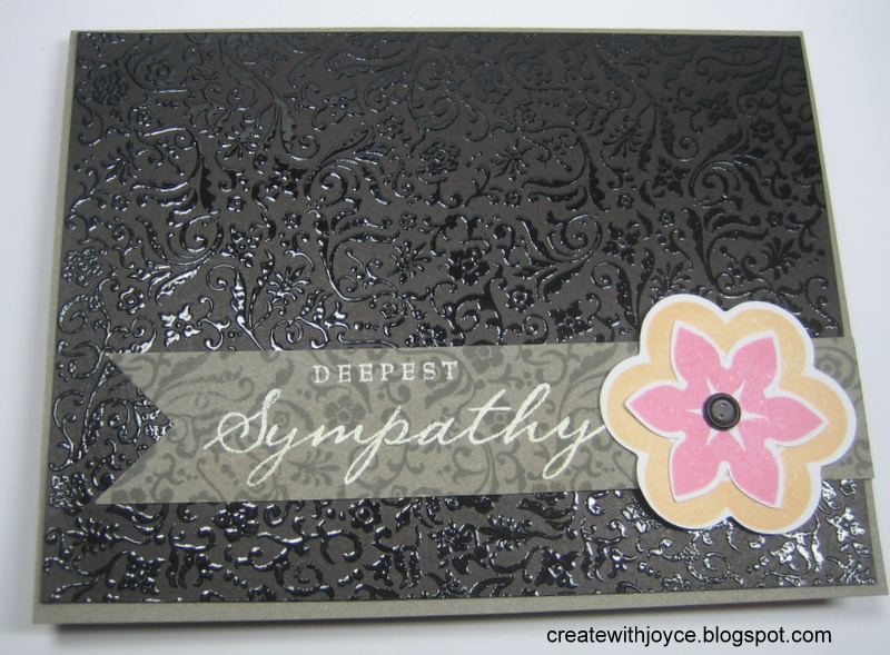
This week The Paper Players' challenge is a sympathy card:
I've used a sketch from Clean and Simple Card Making 2 to make this card:
I went with the traditional dark colors - gray and black but the black background is embossed with clear embossing powder. That stamp is the same one on the gray strip, except that it is not embossed but it is tone-on-tone.
I really like that I am using the same stamp in different ways on a card because that gives a sense of unity. Here's the card from a different angle:
Thanks for stopping by!
I've used a sketch from Clean and Simple Card Making 2 to make this card:
I went with the traditional dark colors - gray and black but the black background is embossed with clear embossing powder. That stamp is the same one on the gray strip, except that it is not embossed but it is tone-on-tone.
I really like that I am using the same stamp in different ways on a card because that gives a sense of unity. Here's the card from a different angle:
Thanks for stopping by!
Wednesday, February 6, 2013
Plainly White cards
Day 4 of the class focuses on plainly white cards. They really appeal to me, but when I am trying to make them, I tend to believe that it has too much empty space then I normally add a bit here and a bit there. By the time I notice it, the card has already transformed to one that does not have much space.
So this time I literally stared at the card and stopped thinking what I "should" add to it after finishing it. I am learning to embrace the white space and I think I'm liking it!
I've used one of my favorite stamp sets called Card Word Puzzle to make this card. This flower in the set happens to be one of my faves too. I like to stamp it on different color cardstocks then cut them out at different petal layer then stack them up to become a 3-D flower. For this card I simply colored it with color pencil and I didn't even put foam dots behind it. It is a very mail-friendly card!
Thanks for stopping by!
So this time I literally stared at the card and stopped thinking what I "should" add to it after finishing it. I am learning to embrace the white space and I think I'm liking it!
I've used one of my favorite stamp sets called Card Word Puzzle to make this card. This flower in the set happens to be one of my faves too. I like to stamp it on different color cardstocks then cut them out at different petal layer then stack them up to become a 3-D flower. For this card I simply colored it with color pencil and I didn't even put foam dots behind it. It is a very mail-friendly card!
Thanks for stopping by!
Tuesday, February 5, 2013
One Stamp Three Ways
I'm still working on the homework from last week and one of them is One Stamp Three Ways.
I just wanted to see if I could come up with three ways so excuse the same color combo on all the cards. I've chosen a background stamp to brainstorm ideas and I got three.
The first one is to use the stamp as a background stamp. The middle panel was stamped in pear with the polka dots stamp:
Next up is one that I used as as a "patterned paper". I stamped it in pear, then stamped an outline stamp on top of it. See the "H" and "B":
Finally I'm using it to kiss other stamps. Notice that kissing and reverse kissing are used. For the first, third and fifth letters (h, l and o), I inked it up well then stamped it on the polka dots background stamp to absorb some of its ink before I stamped it on the paper. Then for the remaining letters and the exclamation mark, I inked it up and stamped it on the background stamp but I stamped the background stamp onto the paper. If you look closely, you'll see that the two patterns are different. Besides, the "e" is upside down and also right side left, because it is the reverse image that the background stamp has got.
It is quite a bit of fun to brainstorm ideas to use a stamp in multiple ways. I'd love to do the same for other stamps. Isn't it great that we can get more mileage from what we have?
Thanks for stopping by!
I just wanted to see if I could come up with three ways so excuse the same color combo on all the cards. I've chosen a background stamp to brainstorm ideas and I got three.
The first one is to use the stamp as a background stamp. The middle panel was stamped in pear with the polka dots stamp:
Next up is one that I used as as a "patterned paper". I stamped it in pear, then stamped an outline stamp on top of it. See the "H" and "B":
Finally I'm using it to kiss other stamps. Notice that kissing and reverse kissing are used. For the first, third and fifth letters (h, l and o), I inked it up well then stamped it on the polka dots background stamp to absorb some of its ink before I stamped it on the paper. Then for the remaining letters and the exclamation mark, I inked it up and stamped it on the background stamp but I stamped the background stamp onto the paper. If you look closely, you'll see that the two patterns are different. Besides, the "e" is upside down and also right side left, because it is the reverse image that the background stamp has got.
It is quite a bit of fun to brainstorm ideas to use a stamp in multiple ways. I'd love to do the same for other stamps. Isn't it great that we can get more mileage from what we have?
Thanks for stopping by!
Monday, February 4, 2013
Happy Birthday
I love the Gradient Technique so much that I have to make another card!
I'm using the sketch from Retro Sketches:
This time I'm using another color combo: Pear, Lagoon and Twilight. I think it is a good one for masculine card:
The background is just Lagoon cardstock with random stamping of stars from Live Life. The banner is Pear cardstock stamped with Versamark and heat set with White embossing powder.
This technique gives me so much fun and I can't stop playing with it!
Thanks for stopping by!
I'm using the sketch from Retro Sketches:
This time I'm using another color combo: Pear, Lagoon and Twilight. I think it is a good one for masculine card:
The background is just Lagoon cardstock with random stamping of stars from Live Life. The banner is Pear cardstock stamped with Versamark and heat set with White embossing powder.
This technique gives me so much fun and I can't stop playing with it!
Thanks for stopping by!
Sunday, February 3, 2013
Your Perfect Day!
I'm still in the catching up mode. Class 2's homework is to make a one layer card and Class 3 is to apply a new technique.
I've learned this technique called Gradient Stamping and immediately fell in love with it! I am using ink pads from Close to My Heart so I had to spend quite some time to figure out the colors to use, and how to achieve the effect as the instructor did.
Eventually I've picked Blush, Creme Brulee and Sunset to achieve this effect. Then I'm making a one layer card for Class 2's homework and OLW's challenge. See the "HAPPY"s in different colors here:
Honestly I just picked up a stamp from an old set to try it out, but using it for a birthday card appears to make sense so I continued to work it up for this card.
Ardyth has made a stunning one layer card for her challenge - Your Perfect Day. You really want to check it out. Her card describes the perfect day for every one! Don't you agree that those are the elements of a perfect day?
Well, when I was making this card, I can't help thinking about the good time I had on my birthday this year. I then naturally made this birthday card with the gradient stamping technique. Certainly, TODAY is my perfect day, as I finally grasp the technique well enough to make a card. I'm so excited!
Thanks for stopping by!
I've learned this technique called Gradient Stamping and immediately fell in love with it! I am using ink pads from Close to My Heart so I had to spend quite some time to figure out the colors to use, and how to achieve the effect as the instructor did.
Eventually I've picked Blush, Creme Brulee and Sunset to achieve this effect. Then I'm making a one layer card for Class 2's homework and OLW's challenge. See the "HAPPY"s in different colors here:
Honestly I just picked up a stamp from an old set to try it out, but using it for a birthday card appears to make sense so I continued to work it up for this card.
Ardyth has made a stunning one layer card for her challenge - Your Perfect Day. You really want to check it out. Her card describes the perfect day for every one! Don't you agree that those are the elements of a perfect day?
Well, when I was making this card, I can't help thinking about the good time I had on my birthday this year. I then naturally made this birthday card with the gradient stamping technique. Certainly, TODAY is my perfect day, as I finally grasp the technique well enough to make a card. I'm so excited!
Thanks for stopping by!
Subscribe to:
Posts (Atom)